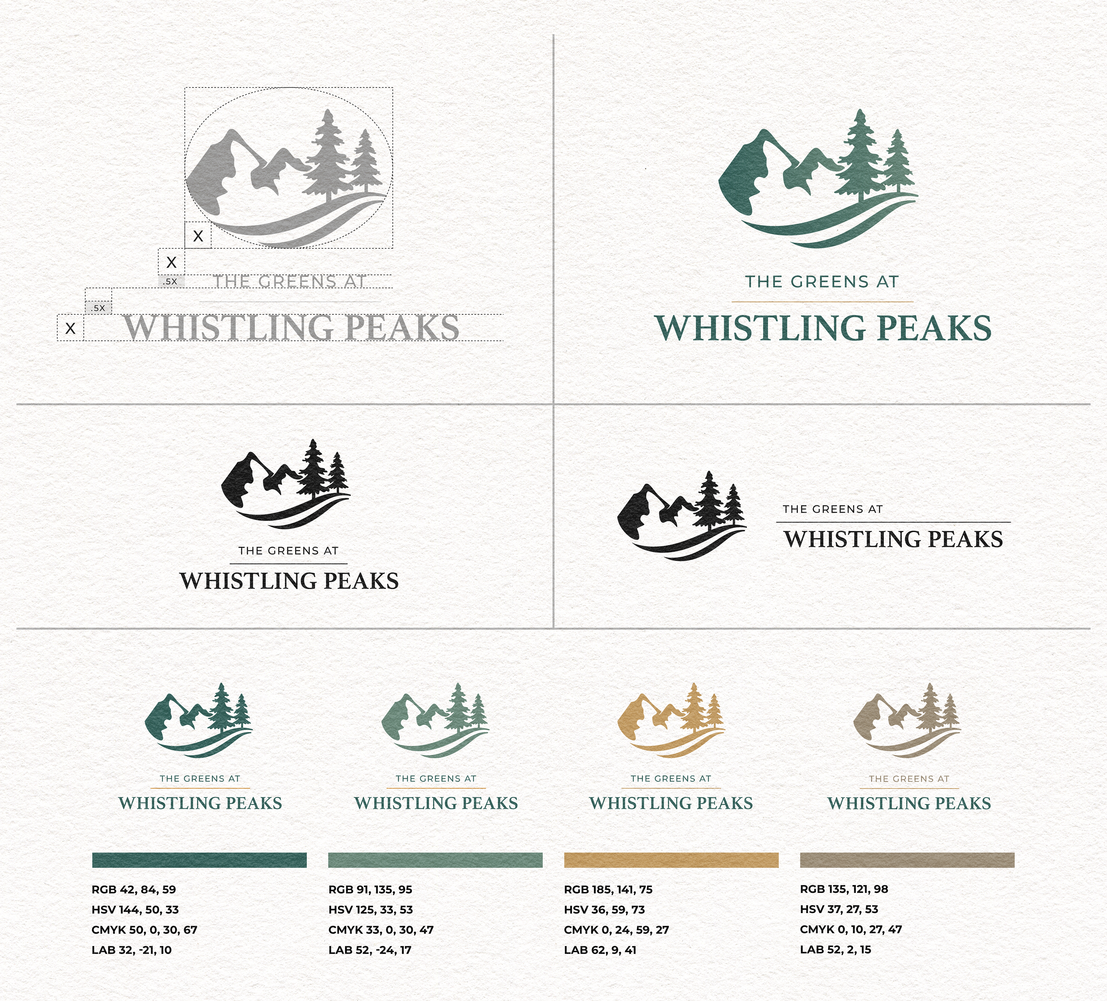


The Greens at Whistling Peaks was developed as a conceptual brand identity for a destination golf community nestled within a mountainous landscape. The goal was to create a mark that balanced the sophistication of a premier golf experience with the natural beauty and tranquility of the surrounding environment. The identity combines rolling fairways, evergreen trees, and mountain silhouettes into a single cohesive mark, creating an instantly recognizable visual representation of the property's setting. A refined serif wordmark paired with an understated color palette of forest greens, muted golds, and natural stone tones reinforces the premium yet approachable character of the brand. Designed to be highly versatile, the system was explored across a variety of applications including golf balls, apparel, signage, print collateral, and environmental branding. *This identity concept is currently available for purchase, adaptation, and further development.*